


The Approach
I began with a detailed discovery phase to understand the product vision, target users, and the founder’s aesthetic preferences. Given the early stage of the company, the process was highly collaborative, with frequent iteration and feedback loops shaping the direction of the brand.
The goal was to create something playful and memorable while still feeling intentional and scalable — a brand that could grow with the product as it moved toward funding and launch.

The Solution
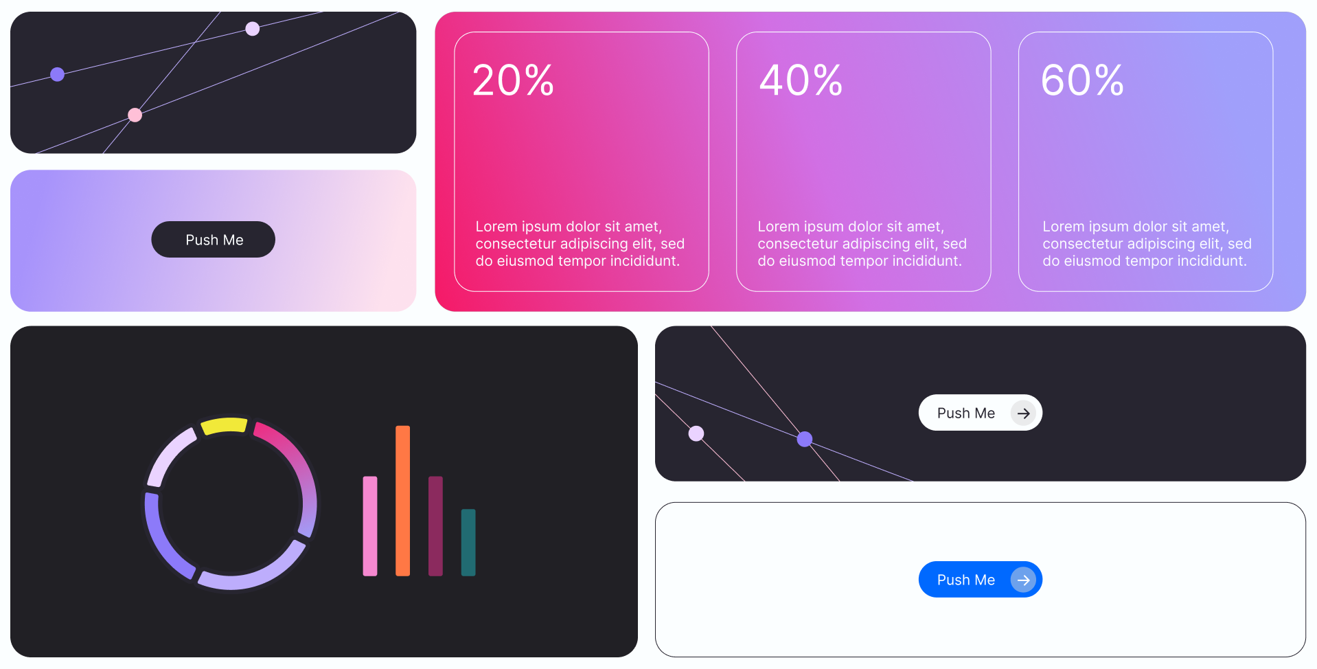
The final identity leaned into a bold, expressive direction inspired by modern synthwave aesthetics. Key elements included:
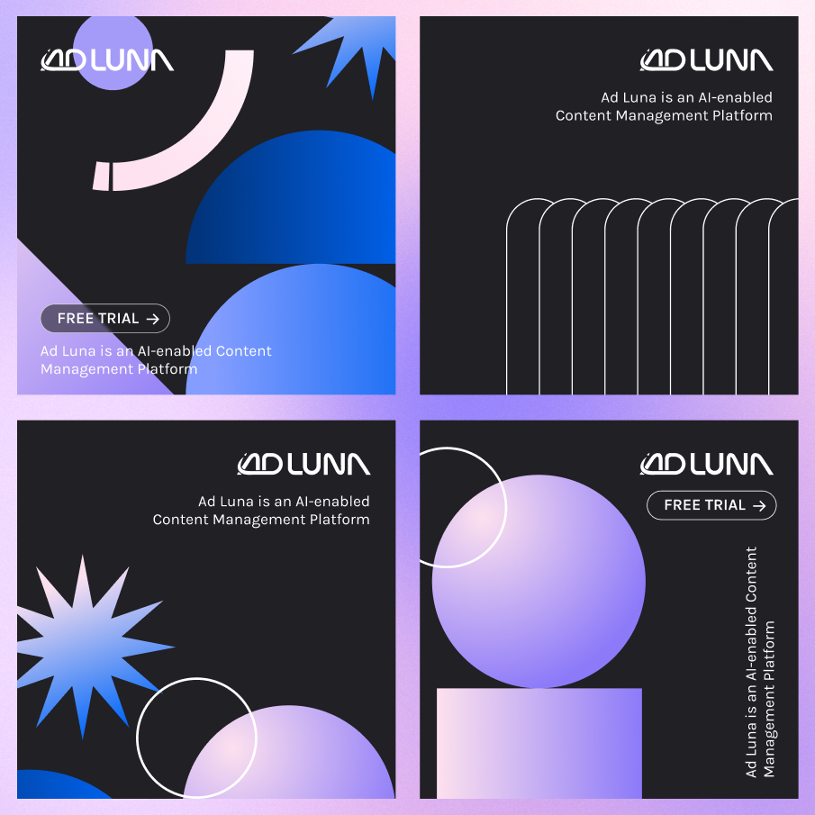
Custom logo and wordmark
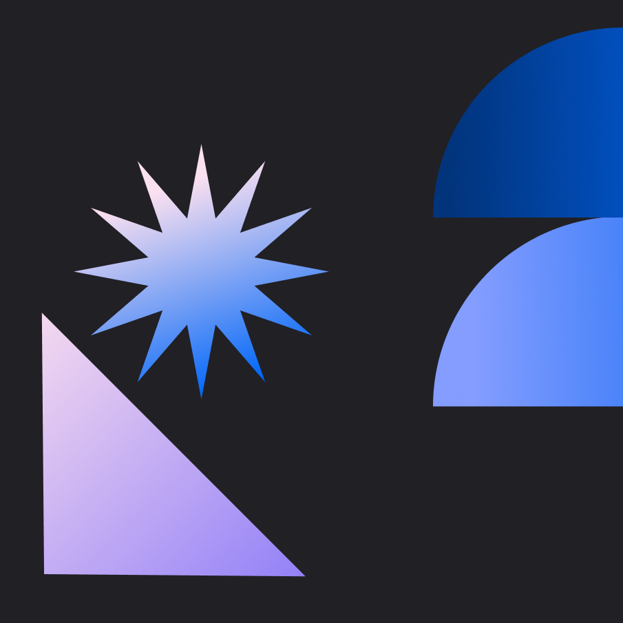
Custom illustrations and icons
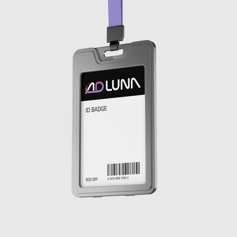
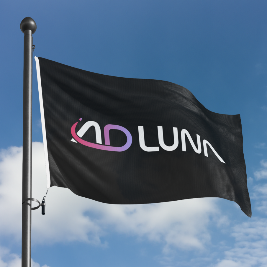
Example brand applications across digital touchpoints
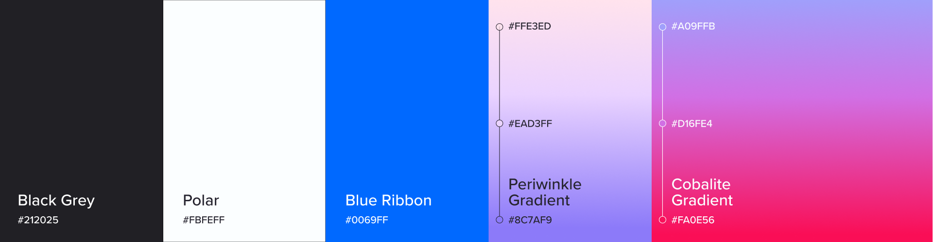
Defined typography, secondary brand language, and, color guide, and tone guidanc
All work was consolidated into a 22-page brand style guide, providing the founder with a complete foundation to build from — despite starting with no prior collateral.

The Outcome
The project delivered Ad Luna a cohesive, expressive brand system ready for launch and growth. The identity now serves as the visual foundation of the startup as it progresses through the startup, with flexibility to evolve alongside the product and team.